
Otto Studio x Studio Bonnie
How we instantly updated our studio with the help of Otto Studio
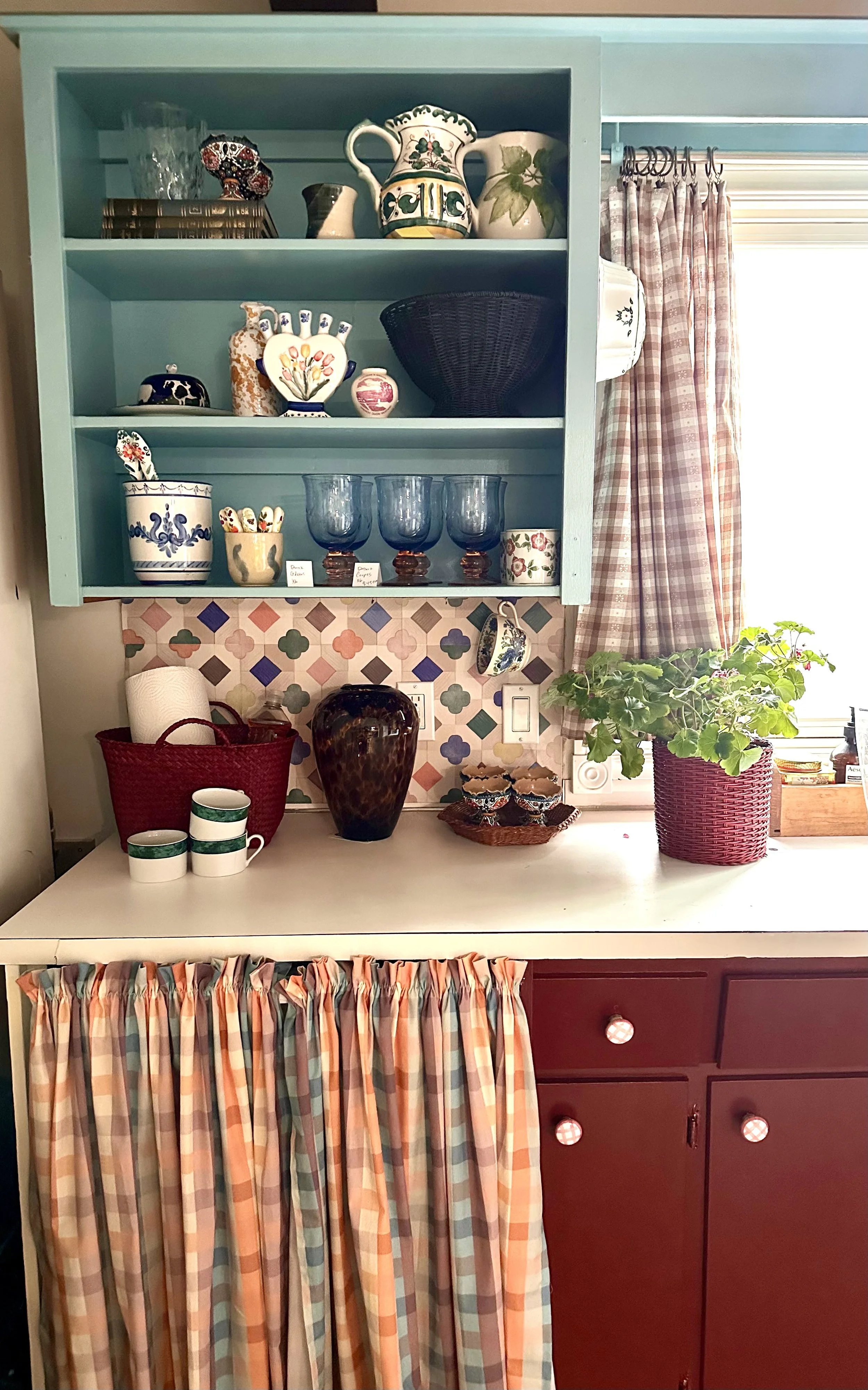
In our own studio being a rental space, we were searching for a surface solution that felt dynamic in both colour and quality but didn’t require a full renovation. We wanted something expressive enough to reflect our work as designers, yet flexible enough to install (and remove) without disruption. Otto Studio came to the rescue.
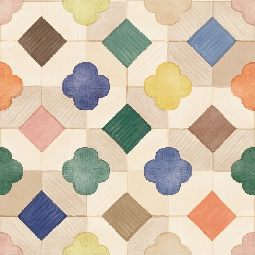
The Jeweled Mosaic achieved that beautifully:
Its multi-tone palette ties the entire space together
The soft quatrefoil motif feels handcrafted and warm
The repeating pattern adds order without visual clutter
And being a removable vinyl tile, it provides a custom look without renovation
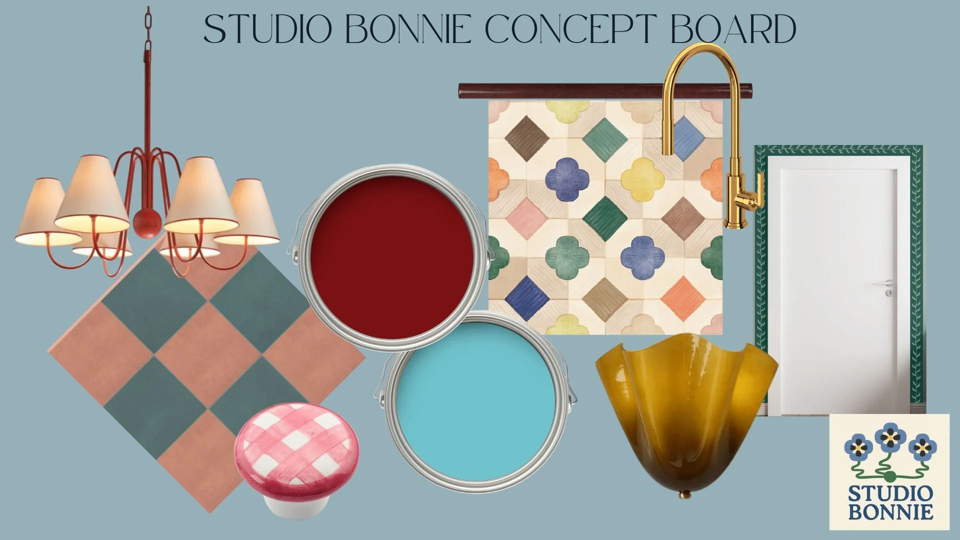
For the palette, we painted the upper cabinetry in Benjamin Moore Passion Blue 2053-50 and the lower cabinetry in Classic Burgundy HC-182.
These rich, contrasting tones meet right at the backsplash, and the tile becomes the bridge between them, pulling blues, greens, corals, and neutrals from across the room.
Here is a photo of the space showing how those colours play together:
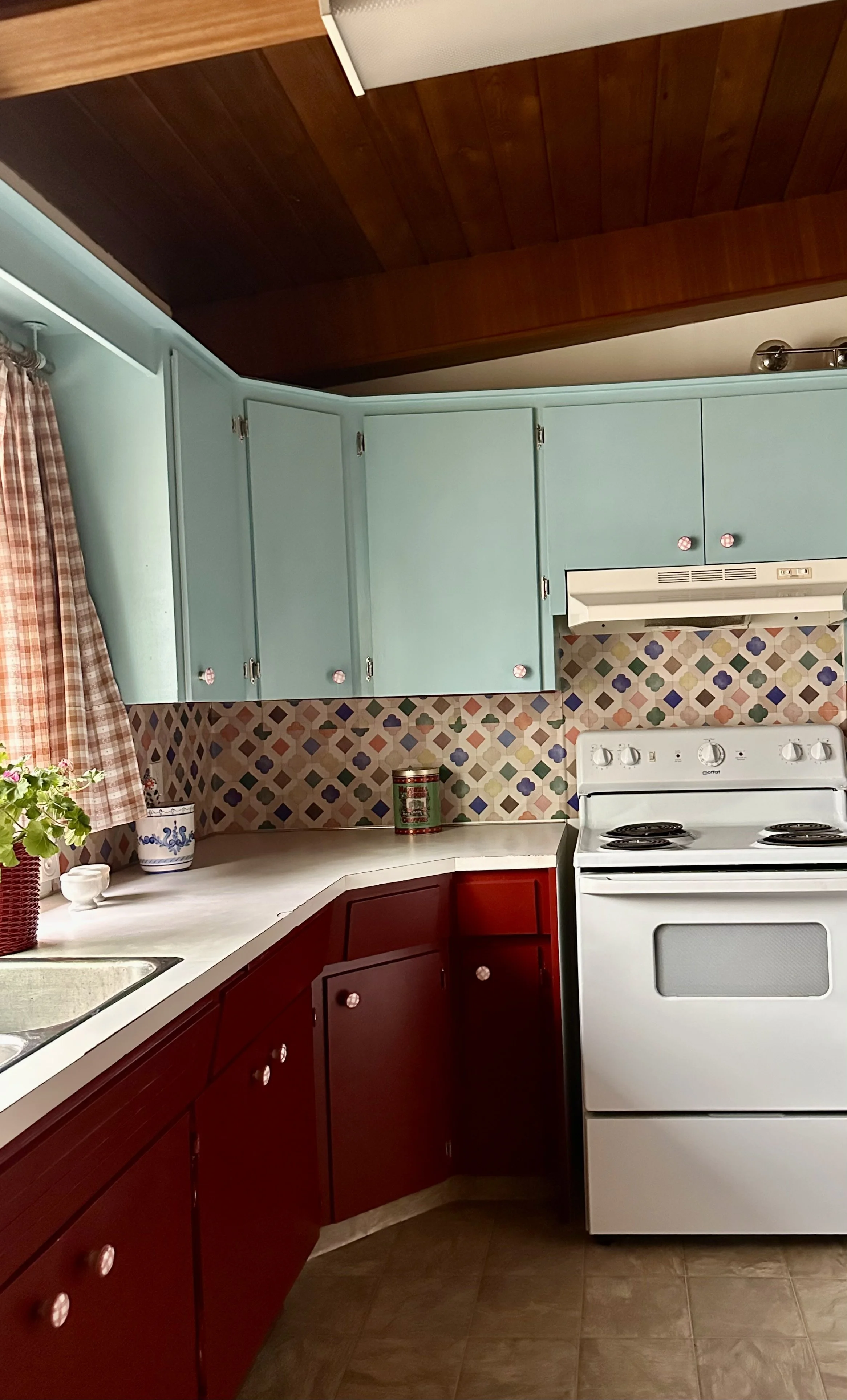
This is a perfect example of how one surface can anchor a design, especially in a smaller kitchen. You don’t need a full renovation when pattern can do the architectural heavy lifting.
How We Choose Wallpaper & Floor Tiles for Client Projects
When clients ask, “Should we do wallpaper or tile?” our answer is almost always the same:
These aren’t just decorative choices, they are architectural ones.
Wallpaper and tile set the emotional tone of a room before furniture, art, or styling ever enter the picture. They are foundational, and we select them with that intention.
Here’s how we approach these decisions in real projects and why we often look to Otto Studio for pattern and colour.
1. Scale Matters More Than Style
A pattern can be stunning, but the wrong scale will fight the room.
Large-scale pattern reads from a distance ideal for dining rooms, hallways, and open spaces
Small-scale pattern excels in powder rooms, built-ins, and nooks
Geometrics bring structure without overwhelming
2. Balance Between Walls & Floors
Wallpaper and tile should support one another, not compete.
If the floor is bold, keep the walls breathable
If the wallpaper has presence, ground the space with quieter floors
Matte finishes read warm and traditional; glossy finishes feel crisp and contemporary
A room only feels busy when everything tries to be the focal point.
3. We Don’t “Match” We Create Relationships
Beautiful rooms aren’t matchy. They feel collected and intentional.
When we select wallpaper or tile, we look for:
Shared tones
Similar warmth or coolness
Shapes that speak to one another
Colours that echo from room to room
4. Lifestyle Matters
Design must suit how a home is lived in.
Some clients want permanence; others want flexibility.
Vinyl tile is excellent for rentals, small projects, and low-commitment upgrades
Traditional tile offers longevity and architectural value
Modern wallpapers are durable, cleanable, and humidity-safe we regularly use wallpaper in kitchens, bathrooms, and mudrooms
Durability is no longer a limitation.
5. Personality Wins
Wallpaper on a ceiling, tile wrapping a wall, pattern in unexpected places — these small decisions make a room memorable.
Otto Studio’s catalogue strikes the perfect balance, joyful but not trendy, character-filled but not theme-like.
Final Thought
When wallpaper and tile are chosen as architectural elements, not afterthoughts the rest of the home falls into place. These surfaces define mood, build palette, and add depth in a way flat paint cannot.
If you’re renovating or simply wanting more personality, start with one surface: a backsplash, powder room wall, or entryway floor. One bold moment can transform the entire house.
